
Cork and Cloth
Improving sales and brand loyalty


Overview
Client: Lisa Perea, owner of Cork and Cloth
Timeline: 4 weeks - 24 hours/week, includes Weekly Stakeholder meeting and boot camp mentor meetings
Role: End-to-End Product Designer (UX Researcher, UX/UI Designer, UX Writer, Usability Tester)
The Background
Cork and Cloth is a two year old fabric retailer owned by Lisa Perea, who sells quality, hard-to-find specialty fabrics like quality Cork and Vlisco. Before 2020, almost 100% of the shop’s sales were in person at craft shows and out of the owner’s home.
Since the pandemic, Cork and Cloth has been leaning into their web community of Facebook & the Shopify site for sales. The Shopify site sales tripled from 2019 to 2020.
The Problem
Cork and Cloth needs to reflect their lively brand while optimizing the user purchase experience for 100+ products offered.
User base is changing: Cork and Cloth wants to catch the younger market that is shopping online and maintain their amazing customer service in a digital world.
Shopify site sales tripled from 2019-2020: The owner feels out of touch in this new digital arena and needs help to bring her ‘real world’ vision to the online platform.
The Solution
I’ve redesigned a responsive, accessible website that creates high level solutions that
Keep customers engaged and happy.
Can increase business sales with new features.
Project Goals
The Project Goals for my work show those of both the business and the user while taking into consideration technical work.
The three priority goals that span across the project are that the design must be/have:

Pleasurable
Business: Enjoys creating and maintaining
User: Engaged, inspired
Technical: Consistency, Functional

Easy
Business: Clear offerings and brand
User: Purchase without confusion
Technical: Straightforward to maintain

Confidence
Business: Validates online setting
User: Feels good about purchase
Technical: Uses best practices
Discover with empathy
What else is out there?
In order to determine those project goals, I first spoke with Lisa to learn about how her business works. I learned about other businesses in the field by reviewing their strengths and weaknesses in a Competitive Analysis. I checked out other small businesses as well as Joann, the big fabric giant. The small businesses pride themselves on expertise. Fabric is a small world, and Lisa knows most of the competition personally.

What do sewists see, say, think and feel?


Cork and Cloth customers are no longer just aged 65+ quilters and small business owners.
There are hobby sewists, experts or those who dabble, as young as 40 that are also shopping on the site.
I interviewed five sewists, aged 35-75. From these interviews, I discovered that:
Online Shopping brings users:

Comfort
Trust detailed reviews
Appreciate variety of visuals

A safe experience post COVID
Convenient and sanitary
Re-ups fabrics they have bought before

Negative experiences
Disappointed when quality misses expectations
Miscommunication
Cork and Cloth users need:

Education from experts
Inspiration about options and uses

Trust in high quality product
Getting “the feel” of the fabric
Loyalty in return purchases

Special Products
Unique merchandise
Ambiance of locally owned business
Keeping one user in mind
I synthesized my Empathy Map findings into a well rounded, target User Persona. The stakeholders were very interested in this from a marketing perspective! They’d put off creating a persona for years now, and were glad to have this resource to refer to for future decisions.

Francis Heller
“Seeing my finished product is the best feeling!”
Goals
Available expertise, attention
Support local business
Seamlessly buy what they need
Frustrations
Disappointment with quality
Inability to feel a fabric
Needs
Specialty product
Trust in high quality
Education from experts
Motivations
Learning and improvement
Inspired by sewing community
Creativity for projects
Define the design strategy
How Might We solve for user needs?
I detailed Problem Statements along with a storyboard of the ideal user experience and how it would leave them feeling delighted. This helped inspire me to brainstorm solutions as I visualized the best journey.
How might we make the unknown of “the feel” identified and known?
How might we rely on other sewists to help us cultivate community?
How might we be sure that clients are informed and clear on what options will be best for them?
Heuristic Evaluation reveals problems with existing flow
Knowing who the user is and what they want, I audited the current site to see how it measured up to the user needs. The current site problems mirror the user frustrations.
Overwhelm in Options
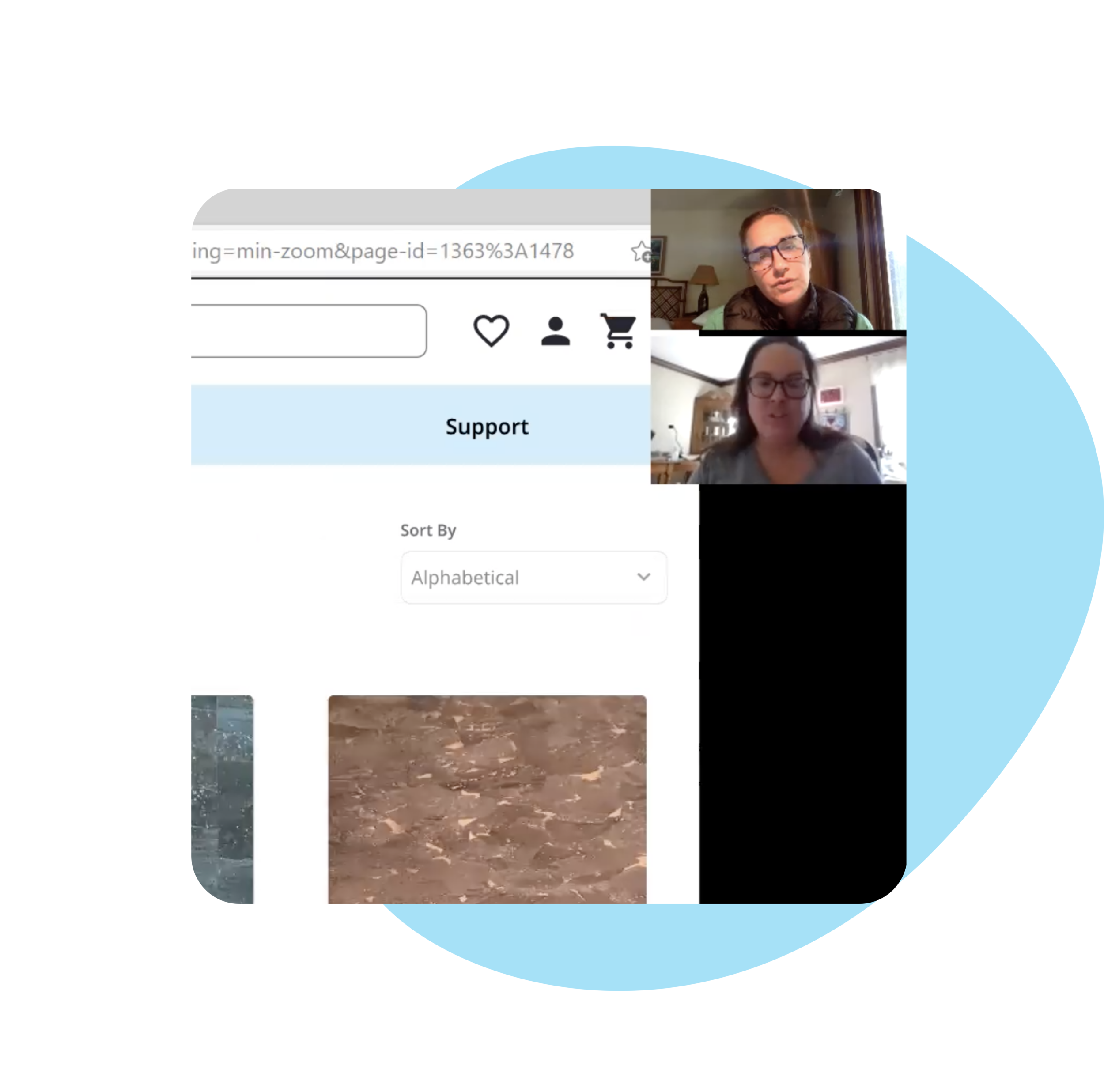
There’s no way to pare down the over 100 products to choose from during the browsing process. The user might be able to use the search bar if they know what they are looking for, but there was no guidance or help with where to start this process. There are also visual inconsistencies in photo sizes and presentation of offerings.

Sort by Alphabetically, How to Browse? Filter? Inconsistent Photo Layout
Limited User Engagement
If a user was interested in exploring or checking out multiple products, the only way for them to browse again was to start over at the home page or know exactly what they want. There was no offer of expertise on the product with what may interest them or what others in the community say. If product is not in stock, user was stuck on page with no options but to start over.

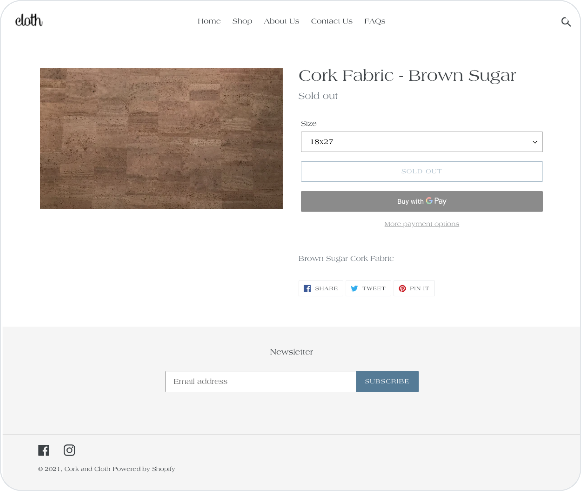
What is the product actually like? When product is sold out, where to go now?
Missing Lively Brand
The professional, polished nature of Lisa’s in-person business was lost, starting with the homepage (on right). The friendly atmosphere of being welcomed into Lisa’s home shop is missing from the sparse website that highlights one overexposed visual.

What’s the vibe? What are the products? How is this inspiring?
Filtering 100+ Products
Time for some Information Architecture solutions! Cork and Cloth has over 100 products for sale in addition to other areas of information and service. The Dendrogram from my Card Sort confirmed my assumptions of categorization and filter necessity.
I prioritized what should be in the MVP in this redesign with a Product Road Map. The sewist should be able to easily start their purchase, filter to what they want, and then have an unavoidable way to add to cart. I didn’t need to work on checkout, since that is a fixed flow by Shopify.

Category, Availability/Promos, Color, Finish, Pattern, Price
Workflow additions can increase profits
The old flow has the right pages, but they are missing information to include desired user actions. I added in Filtering to the flow to create a space where users can easily buy with confidence that they have seen what they need. I created a User Flow before working out to be sure that there were indirect paths to success and eliminated dead ends and potential overwhelm for users that exists with the current site.

Updating the Design
After busting out low fidelity wireframes of the flow, I reviewed the project goals and passion of business messages to focus on the small business atmosphere that Lisa has created in her offline shop.
I was sure to make sure that the High Fidelity Wireframes highlight Brand Attributes of: Inviting, Bright, and High Quality in the Style Tile and site UI.
Usability Testing the New Design
I created my prototype in high fidelity so that I could get branding feedback during user testing. I tested 6 participants, aged 23-42 (Female/Male) with varied fabric expertise. After testing, I clustered patterns with an Affinity Map to highlight metrics and issues.
Testing Success Metrics
6/6 User Success: Clear Path to Browsing. 5/6 participants started shopping through home page hero image.
6/6 User Success: Product Page image carousel inspired and informed users.
5/6 User Success: Secondary images from product page inspired users to continue shopping without hesitation
4/6 User Success: Similar Products offered inspiration, would want to use them to help decide on purchase
Testing Win: Home Page
The inviting and cute brand is now showcased but the color isn’t heavy or overbearing.
“Bright, clean, friendly”
Old
lacking brand, can’t see products, competing CTAs

New
simple, inviting

Testing Win: Imagery
The user can see and be inspired by being able to view what finished products are possible with the fabric in which they are interested. With the photo carousel and including the product in scale, the user can feel confident in what they are getting.
“This is what you can do with fabric.”
Old
one zoomed photo, minimal details
New
thoughtful product details
Testing Win: Product Page
Now, similar products are displayed based on filters used. Shopping patterns shows complementary items during the purchase.
“Straightfoward, smooth, simple”
Old
dead end with no options, even when sold out

New
choice, supplements
Testing Win: Reviews
The top of the product page has anchor link from star rating to reviews in details. There’s a space for customers to upload images to encourage engagement as inspiration.
“Great focus on the product”
Old
Missing any type of review
New
helpful, community driven, inspiring
Iterate for Priority Revisions
Progress, not perfection
I was able to hone in on two areas that could use further improvement based on user experiences during testing. The data provided through tests was able to guide me towards these nuanced changes. These changes needed to be made on the Gallery and Product page.
Minimize any dead ends for out of stock product
Might abandon the site completely (1 user).
Are interested in preordering (all users) but don’t see a way how to do so (2/6).
Would probably look at other sites for specific item.
Wouldn’t click on the product from gallery since it’s sold out, but might click on product if there was an est. back in stock date.
Need for very detailed filters
Filter names aren’t always clear- can’t tell what is shiny by images, and some users don’t intuit that metallic means shiny.
Wouldn’t look for natural in “brown/tan.” Might look for natural in “beige.”
Expert user expect to see more nuanced categories.
Iteration of the Gallery Page

Iteration of the Product Gallery Page

Results
The website redesign has been approved by the stakeholders to move into development.
Lisa feels confident with the changes and is excited to move forward. The clean and friendly layout reflects the brand and the company message. The site design eliminates dead ends for browsing and purchasing. The imagery offers inspiration to users. After implementation, we will be able to review and determine metrics.
Takeaways
The primary business takeaway was how valuable my work would be for potential sales and metrics. Additionally, I noticed that Lisa really appreciated the support as I advocated for her business goals with data from user research and best practices. It was so important to design for her current business model with room for growth, rather than implement ideas because competitors were doing it. I found that because I gave Lisa time and space to articulate her thoughts and concerns, the project continued to improve and she became more proud and excited and confident with the venture of the online site.
See the Prototype
The Figma prototype first paves the journey for a user to buy Navy Metallic Marble Cork Fabric. The secondary task is to add Natural Metallic Rainbow to cart (even though it is out of stock).
Next Steps
Now that the design is approved, we can begin to implement the changes in increments onto the store’s Shopify account. From there, we will be able to see the metrics of an increase in sales and review customer satisfaction.
While we wait for sales metrics, I can continue with additional phases of auditing secondary site pages. I can move forward with consistent messaging and user flows that lead comprehension and increased brand loyalty.